![]() There has been a discussion on the XNA forums regarding a slight decrease in the visual quality
of SpriteFonts from XNA 3.1 to XNA 4.0: XNA 4.0 renders SpriteFont
differently (and not for the better).
There has been a discussion on the XNA forums regarding a slight decrease in the visual quality
of SpriteFonts from XNA 3.1 to XNA 4.0: XNA 4.0 renders SpriteFont
differently (and not for the better).
There are two changes that might have impacted visual quality: XNA 4.0 uses premultiplied
alpha everywhere (whereas XNA 3.1 processed the alpha channel as-is) and, as revealed by
"Krome Studios", The FontDescriptionProcessor in XNA 4.0 generates
a texture with DXT3 (a form of compression that limits each block of 4×4 pixels to contain
only 4 different colors and reduces the alpha channel to 4 bits of precision or 16 levels,
see Wikipedia).
Because I’ve written a custom FontDescriptionProcessor for XNA 4.0 which outputs compatible
SpriteFonts but uses FreeType instead of Windows’ GDI font
API, I decided to do a little comparison.
XNA 3.1
I created a new project and made it draw some text on the screen. Here’s what it looks like:

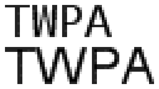
The bunch of letters is supposed to highlight issues with antialiasing of diagonal lines and kerning problems. Let’s take a closer look at the W character:

We see that the gradient created by antialiasing is a bit blocky – as if there were too few shades of gray to go through.
XNA 4.0
I repeated the same steps in XNA 4.0 and look what happened here:

At the first look, we may notice only a bit of graininess on the edges of some characters, but zooming in shows that there are really only 4 colors being used here black, very dark gray, gray and white:

XNA 4.0 w/ Nuclex font processor
The initial XNA 1.0 release didn’t have SpriteFonts. Back then, I provided
Nuclex.Fonts to fill that gap. As XNA 1.0 Refresh, 2.0, 3.0, 3.1 and 4.0 came out,
I updated my content pipeline DLL to write .xnb files in the same format
as XNA’s own SpriteFonts, allowing it to act as a transparent replacement.
It uses FreeType, an OpenSource font rendering library and doesn’t do texture compression (so your fonts will consume more memory!). FreeType claims to support 256 levels of antialiasing, so let’s see what we get:

Looks a bit smoother already, eh? Here’s the zoomed-in version:

Conclusion?
I have to admit that I don’t really see that much of a difference. I will be using my custom font processor in my own games for a completely different reason: its default origin is at the text’s baseline (that’s the lower end of characters like abcd – other characters, eg. qpyj extend below the baseline) instead of the text’s upper left corner. I find the baseline to be a much better point of reference.
If you’ve got good eyes or are concerned about the looks of your text for another reason, you can find my custom font processor in the binaries of my Nuclex Framework. Just add a reference to Nuclex.Fonts.Content.TrueTypeImporter.dll to your content project and select "Sprite Font – Nuclex Framework" instead of "Sprite Font Description – XNA Framework" as the "Content Processor" for your *.spritefont files (see the official docs for an illustrated how-to).
As I wrote above, using my font processor the vertical origin will be the baseline, so after switching, your fonts will jump upwards by a bit, which you will have to compensate. The font sizes of FreeType also don’t accurately map to Windows GDI. Just adding 5 to the font size appears to produce the same size of the XNA font in most cases.